


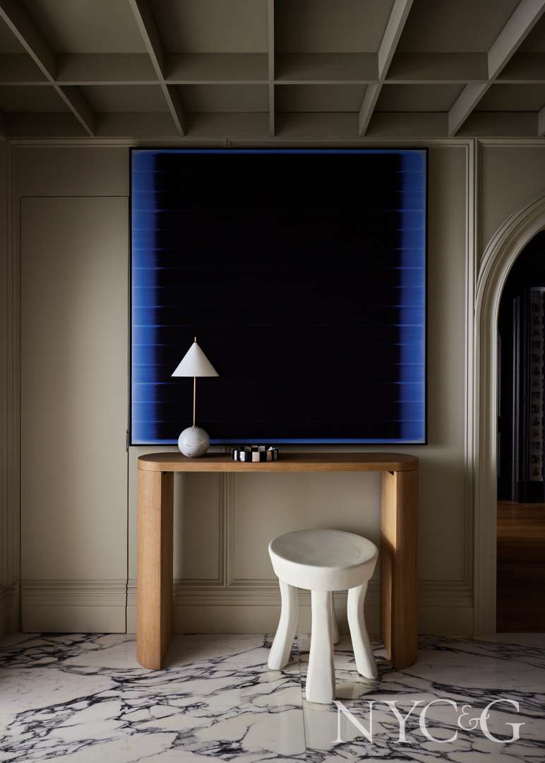
Artwork by Tom Bolles is displayed over a console from RH in the foyer.
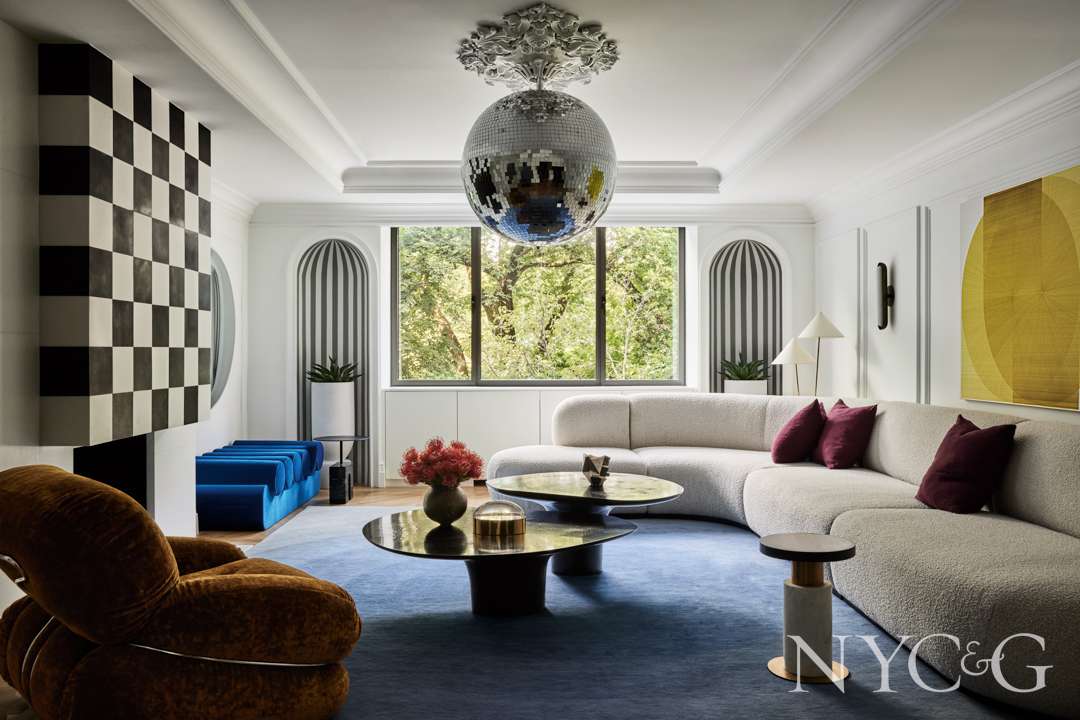
The living room’s artwork is by Thomas Trum, and the rug is from Warp & Weft.
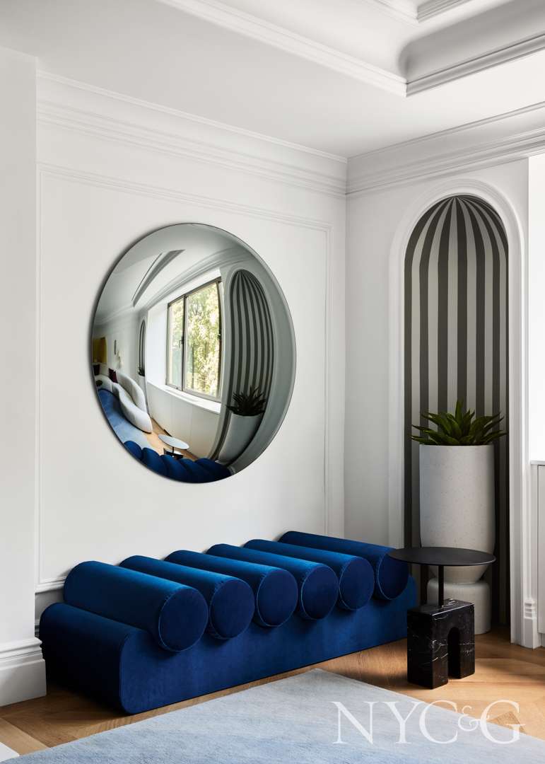
In the living room, a mirror from Ali Yikin Glass Art Studio hangs above an Owl daybed from 1stDibs.

The all-white kitchen boasts custom cabinetry and countertops.
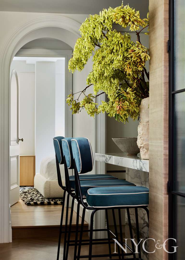
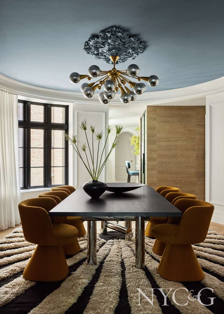
In the dining room, a ceiling fixture from a vintage shop in Paris hangs above a table from Egg Collective. The chairs are from B&B Italia, and the rug is by Crystal Sinclair Designs.

In the primary bedroom, a custom headboard is covered in a fabric from Kravet. The bed covering is from Parachute.
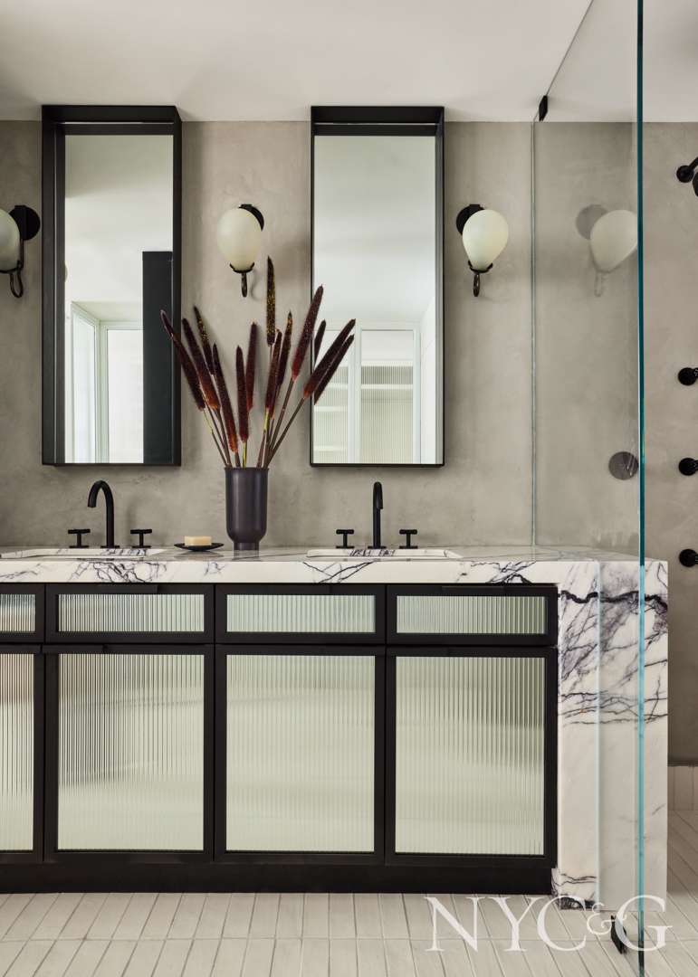
The primary bath’s vanity, with ribbed glass doors, is custom.
When you first met the clients, what were they looking for in terms of design?
Designer Crystal Sinclair: They were wanting something fun and exciting that fits with the city; they wanted a lot of pizzazz. The client wanted something that married “Jackie O.” and Studio 54.
You’ve included a number of sculptural furnishings—they’re almost like art pieces. Was that something you considered from the very beginning?
We wanted fun shapes, just something interesting and absolutely fluid.
The apartment has such a great energy—it’s very elegant while also fun at the same time. How did you balance the two?
I really started with a very elegant canvas. The walls, the ceiling, the floor—everything is more traditional. And with the moldings and crown moldings, and the floor’s chevron pattern, we really wanted to pick traditional elements, the “Jackie O.” elements. Everything has more of an elegant, elevated canvas, contrasting with loud fun pieces.

Where did the idea for the disco ball come from? It’s so fun and unexpected.
Studio 54! It’s a surprise to see it in a Fifth Avenue home.
What were some of your favorite pieces?
The coffee tables come to mind right away. I love the coffee tables; they have almost like a water droplet effect. And the disco ball! It’s not a furniture piece, but it’s definitely a piece in the room that takes center stage. We actually aimed it so it does spin and makes the room kind of glitter. It’s really phenomenal. I love the sofa, too. It’s soft and inviting, but simple.

Which pieces do you feel were the most reminiscent of Jackie O.?
I love the little double lamps behind the sofa. They’re so classic and dainty that they kind of balance both elegance and pop art. I purchased the artwork above the sofa pretty early in the process, so we knew we had to work around this piece and had to think of a color that would work well with that. I think the royal blue works really well with yellow here.
How did you execute the design of the foyer?
I really wanted it to be subtle and not take away from the dining room, because both the living and dining room are flanking this room. It also needs to live up to the hype of the other rooms, but not overshadow them. I’ve always loved a grid ceiling, so I thought a grid ceiling would be a great way to add a geometric shape to the room and make the eye travel throughout the space. I wanted the floor to be a slab floor. That really sets the pace.

What was the inspiration behind the kitchen?
The client wanted an all-white kitchen, so that’s what we gave her. I really wanted the same marble we saw in the foyer to tie the two spaces together. I wanted a marble that had some contrast, so the room wasn’t too white. I would rather stay away from an all-white kitchen, and I wanted contrast to break it up.
How did you select a ceiling fixture for the dining room?
The light took forever to find! We went back and forth on the fixture for months. What she liked I didn’t, and what I liked she didn’t. We finally came across a fixture with a very fun disco ball effect, in a different way, with chrome gold globes. I like that it ties in the chrome and has complexity to it. Starburst shapes work really well with the room. The space is shaped like a big semi-circle, so trying to find something that works well with this odd shape was a challenge.

How did you choose a bed covering for the primary bedroom? And how would you describe the color of it?
It’s kind of a warm blue teal. We worked on the living room first. With the living room being the color that it is, we wanted to pull it into the bedroom. Blue is such a soothing color, and we wanted to bring it into the bedrooms to warm them up a bit.
The marble in the bath is unique. Tell me more!
This is a lilac marble. I’ve been wanting to use it for a long time. It has an elegance to it, and I love the purple, which is not a common color you see in marble. It has a very strong veining that I felt was perfect for the space and plays up the fun part of the apartment.