


“Silver Chain by Benjamin Moore, a beautiful soft gray that goes from a warm gray to a lighter lavender—in any type of light or room exposure.” —Darci Hether, interior designer

Benjamin Moore Silver Chain
“Benjamin Moore’s Bridal Rose. I would use them in a living room with anthracite metal and leather chairs, a boiled wool taupe armless sofa, and two large framed panels of neutral Schumacher Chinoiserie.” —Brett Beldock, interior designer

Benjamin Moore Bridal Rose

“Bird’s Egg, a soft blue by Benjamin Moore. It’s especially nice on the walls, but looks great anywhere.” —Miles Redd, interior designer

Benjamin Moore Bird’s Egg

“Skipping Stone by Benjamin Moore looks like parchment while still remaining light and fresh. It’s a great neutral option if you’re tired of white.” —Neal Beckstedt, interior designer

Benjamin Moore Skipping Stone

“Benjamin Moore’s Million Dollar Red. It’s dark enough to look rich and bright enough to feel fresh. I like using it in sitting rooms and libraries.” —Phillip Thomas, interior designer
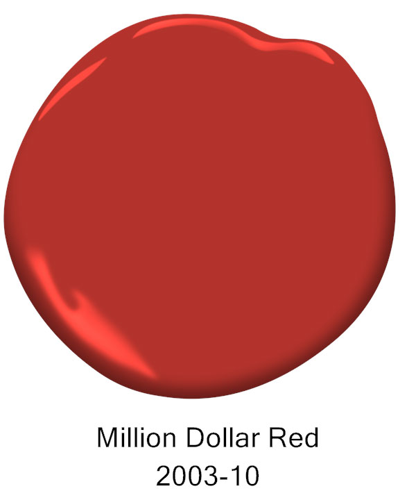
Benjamin Moore Million Dollar Red