


NYC&G: The living room has so much warmth. What was the design directive?
Joan Enger of J. Patryce Design & Company: “The first thing we looked at was the layout. The second thing was the beautiful detail in the molding. We purposely left the back of the bookcases open so they didn’t crowd the beautiful mantle. COVID had just hit, and we wanted this to be a bit warmer and cozier, with rich plums and beautiful creams, blues, and blush colors. It just led the design.
Tell me more about the shades of blue throughout the home.
I try not to follow trends, in general, but what we see influences us for sure. I would say that there’s a movement away from gray; I’m so tired of gray. Blue is a shade of gray, but I love that blue is very classic and timeless. I will never turn away from a blue room.

How do you choose the theme for a home?
I think it depends on the space. I do like to be unique and design something that feels unique to the space, and feels right at the moment. Right now, curves are having a big comeback, and there’s a curve in the fireplace as well. The kitchen is right off the living room—I love the connectivity of the rooms as well as the palette.
Which piece of furniture do you feel executes the concept you were going for the most?
The custom tables in the living room and the built-ins are a really big part of that space, as well as the curve of the furniture; the arms and chairs, everything has those soft curves.
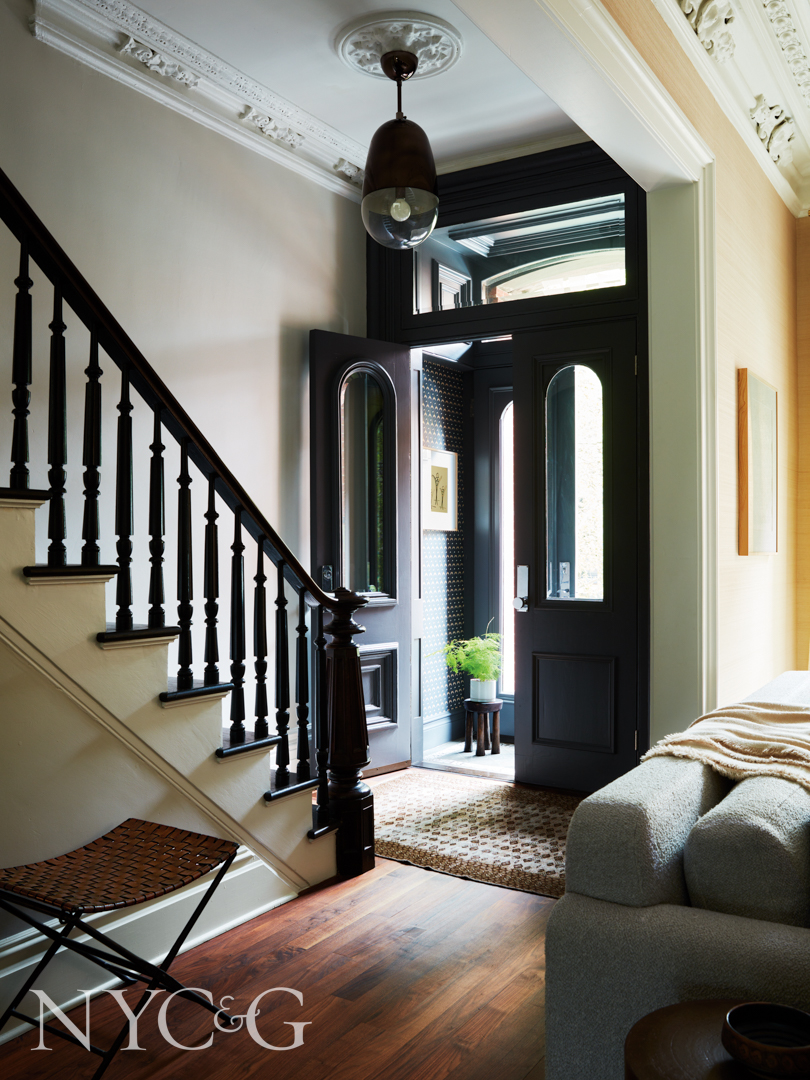
The foyer’s wood detailing is accentuated with a dark paint color.
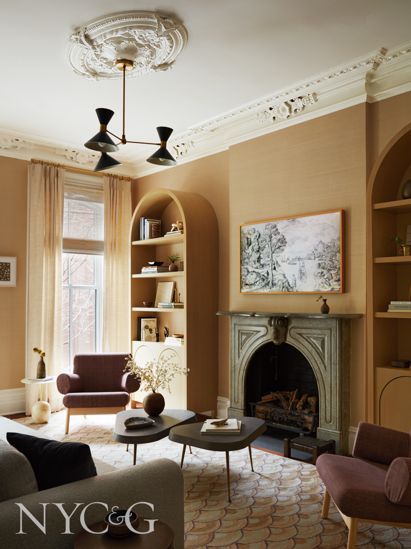
In the living room, custom nesting tables are by JPD Workroom.
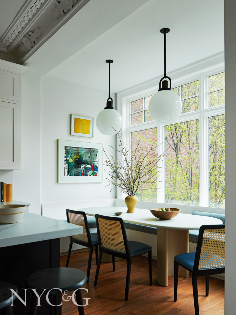
The banquette is by NR Wood Design, and the fabric is from Claremont. The dining chairs are from Simonini.
In the kitchen and dining area, the custom table’s stone top is by IPA Stone.
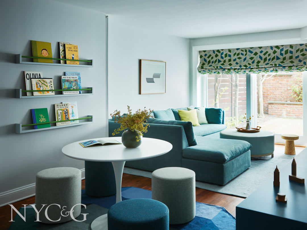
A plush sectional is complemented by a roman shade fabric from Holland & Sherry in the family room. Stools from Blu Dot surround a contemporary game table.
Family room details.
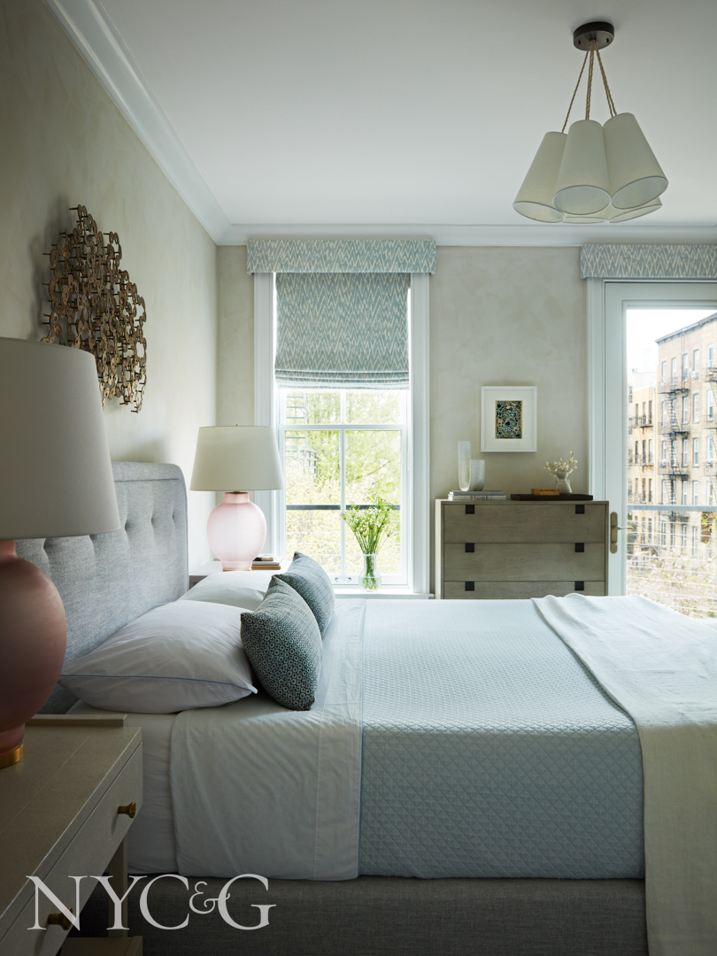
A fabric from Otis Textiles covers the headboard and frame in the primary bedroom.

The nightstands are from Made Goods, and the custom lamp shades are by trans-LUXE.
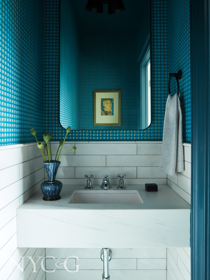
I love the wall design in the powder room. How did you choose it?
We thought wallpaper was perfect because it incorporated all of the different hues that we used in the [adjacent] kitchen and everything connected visually. The ceiling trim we painted a medium-toned blue—I love when the whole thing feels like a jewel box instead of a white ceiling.

How did you select the wallcovering for the bedroom?
That is actually a limewash by Sydney Harbour, so we wanted this to feel like a cocoon, a very special, intimate, and beautiful warm space. I got the sculpture above the bed at auction, and I loved it, and the client loved it, so I was like, ‘OK, we’re doing it!’ We found beautiful lavender glass vintage lamps and had custom shades made for them. There’s a curve to the bed, as well. Even though this room has a different palette than the living room, it still references the theme.
How were the clients during the process? Were they willing to take risks?
The clients were definitely all for it. They were trusting, and that is definitely a recipe for a good project. It’s a collaborative process, but if you let us be the experts, then it’s a great outcome all around.