


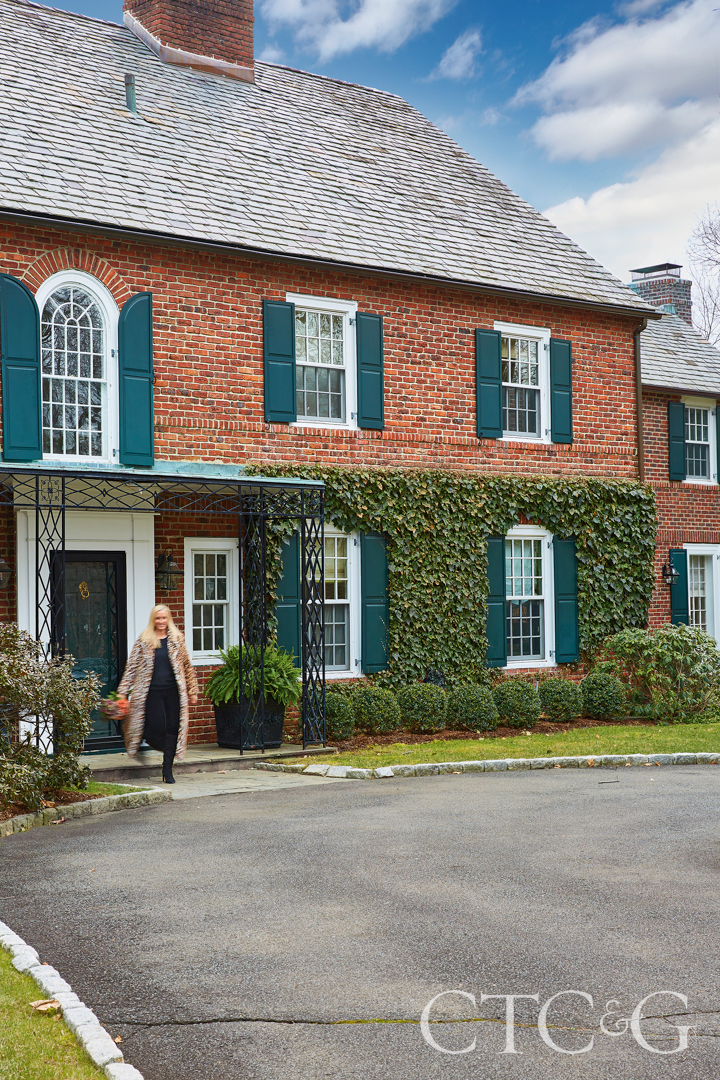
How do you manage to make a Greenwich Colonial feel updated and classic without it looking like every other house on the street? The answer, according to interior designer Jamie Garcia, is as simple as listening to your client. Garcia, a designer based in Greenwich and Newport, RI, met the client through a referral and they immediately hit it off. “Jamie was so easy and pleasant to work with. She really listens and she doesn’t try to push things,” says the client. “I have worked with others who are aggressive, and their way is the only way, but Jamie works with what you really want—she took my vision and ran with it. I wanted a less heavy feel—classic and transitional, but I wanted it to feel light.”
Stepping inside the house, an open grand foyer has a partially winding staircase and a view straight through to the outdoor terrace. “Everything was pretty neutral,” says Garcia. “We left the foyer as is, but the family room did not feel like her [the client]. She wanted a cleaner, sleeker look, but not modern. I kept asking her, ‘what color do you love to wear?’” They landed on camel and Garcia got started.
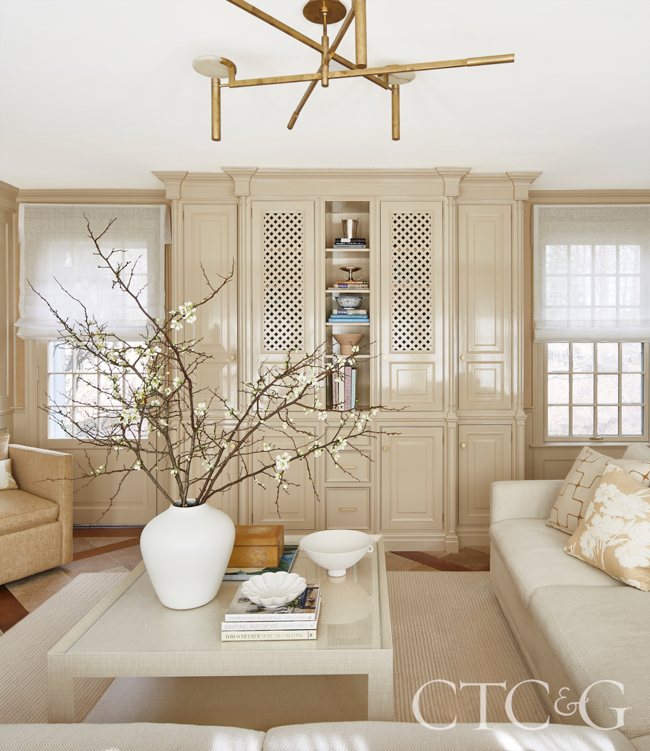
The family room had original millwork and cabinetry in impeccable condition, but slightly yellowed and aged. Garcia opted to keep the bones but make them look more alive. “We chose a luxurious shade of camel—our common thread throughout—created a custom color and painted the millwork in a high gloss. Then, we searched for a grasscloth to blend and create a monochromatic look, keeping the room looking chic but approachable” says Garcia. “She wanted something calming and nothing floral—she had committed to a lot of floral before.” Sheers on the window filter light without taking away from the lush outdoor views. Accented with a custom parchment table, Ralph Lauren pillows and a Kelly Wearstler fixture, the room is neutral but still makes a statement. “She [Garcia] led me toward things that I wasn’t using before, like high gloss paint and grasscloth. It’s monotone but serene and cozy,” says the client. “Everyone who walks in the room says it is an oasis.”
The armchair is vintage through JHuhn Lifestyle, and the Adele side table is through Bunny Williams Home.
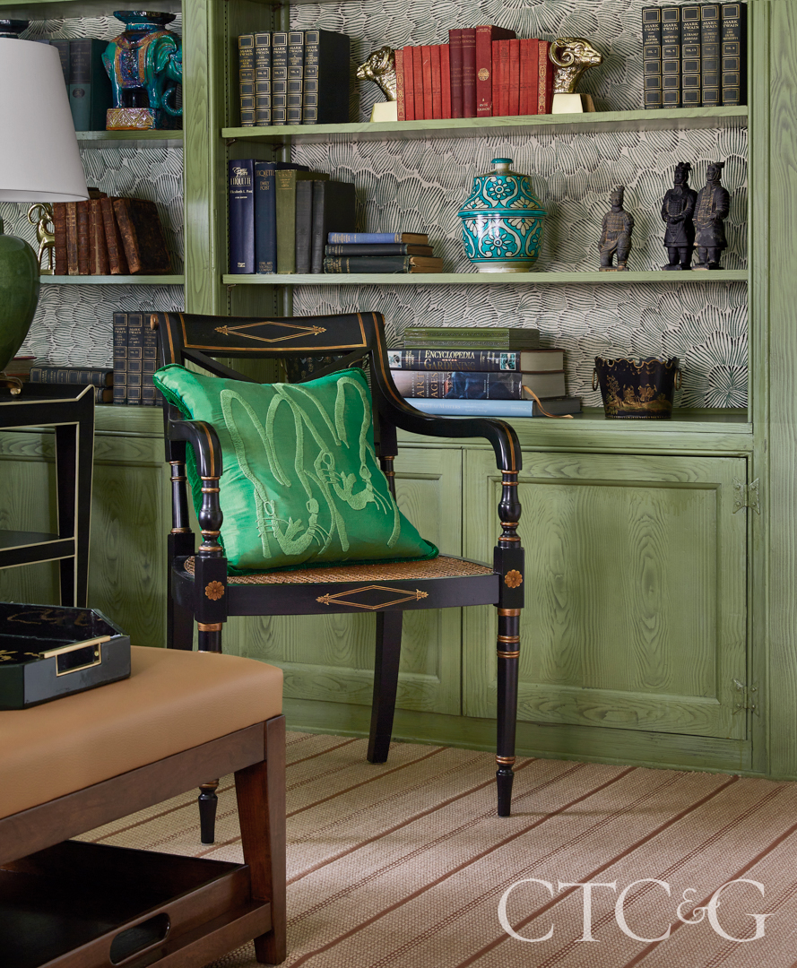
Designer Jamie Garcia had the millwork in the library painted a custom green faux wood by Stephen D’louhy of Floe Painting. The custom sofa wears a Schumacher velvet. The Ginkgo Embroidery window treatments are also Schumacher, and the round side table is through Serena & Lily.
In the family room, the original millwork was painted with a custom hue in a high gloss. The coffee table is custom, and the overhead fixture is Kelly Wearstler for Visual Comfort. The wool carpet is though A.T. Proudian.
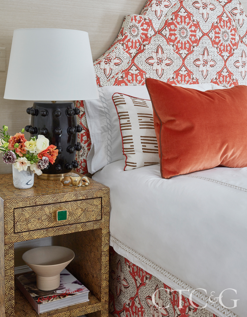
Quadrille’s New Batik covers the headboard in the daughter’s room, where the bedside tables are custom with Addison Weeks hardware.

In the daughter’s room, a Bunny Williams Home Brush Stroke lamp tops a chest.
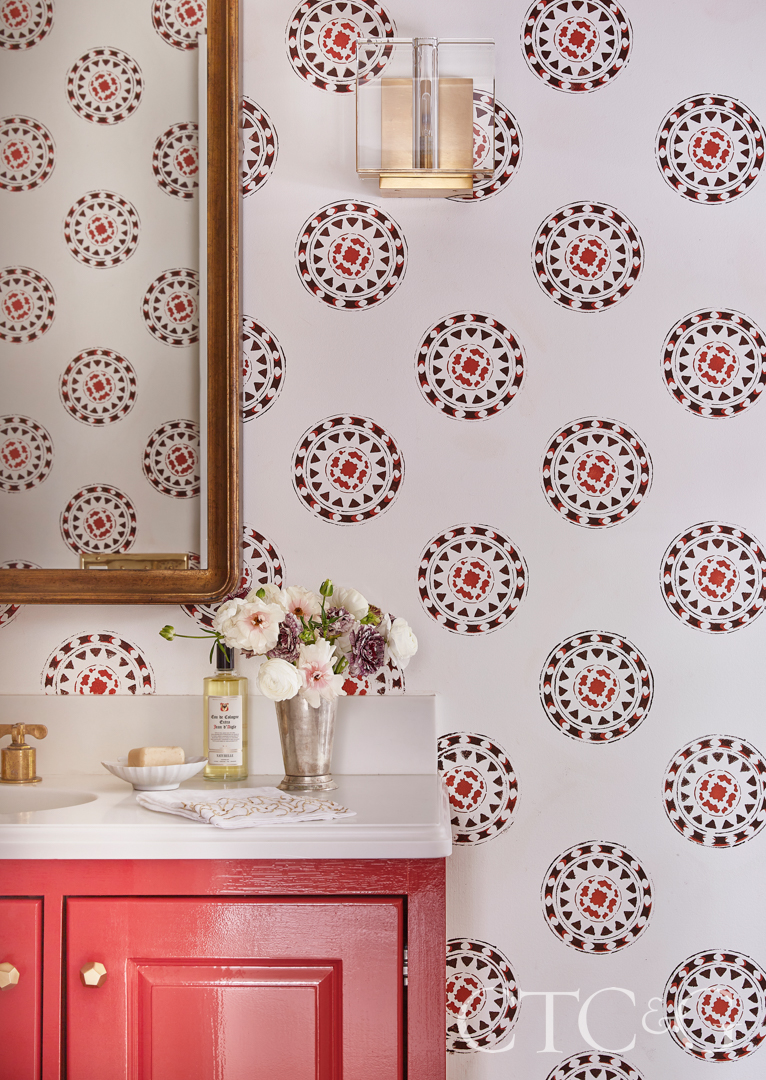
In the bathroom, Garcia designed a stencil to riff off the headboard material. It was applied by Stephen D’louhy.
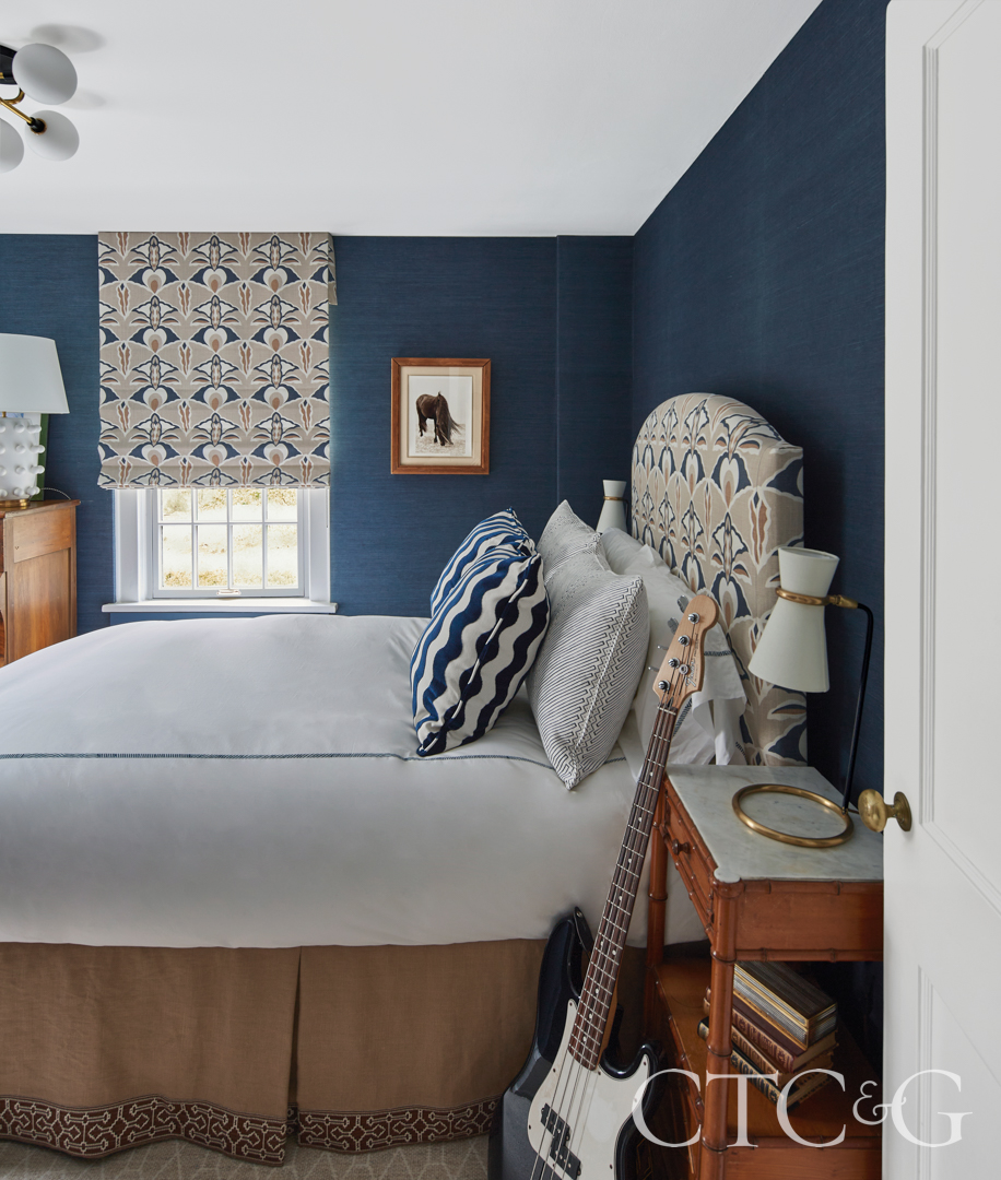
A navy Ralph Lauren grasscloth covers the walls in the son’s room; the material on the windows and headboard is by Serena Dugan.
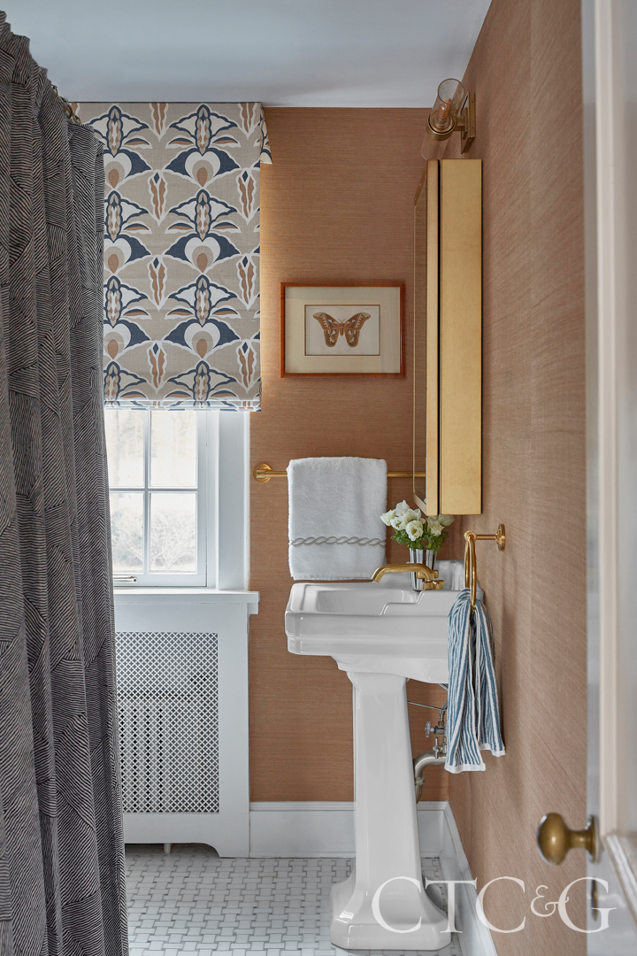
The same textile repeats in the bathroom, where the walls are papered in a rich honey brown grasscloth.
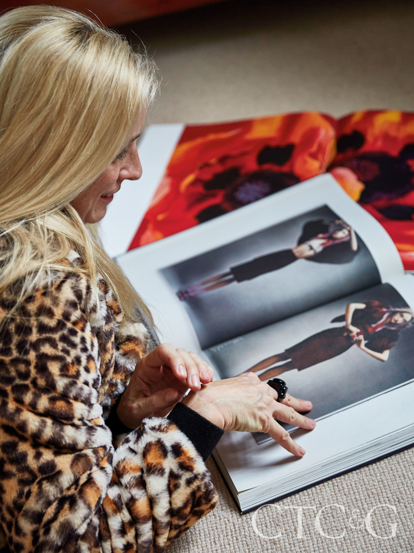
The designer’s faux fur coat is custom through JHuhn Lifestyle.
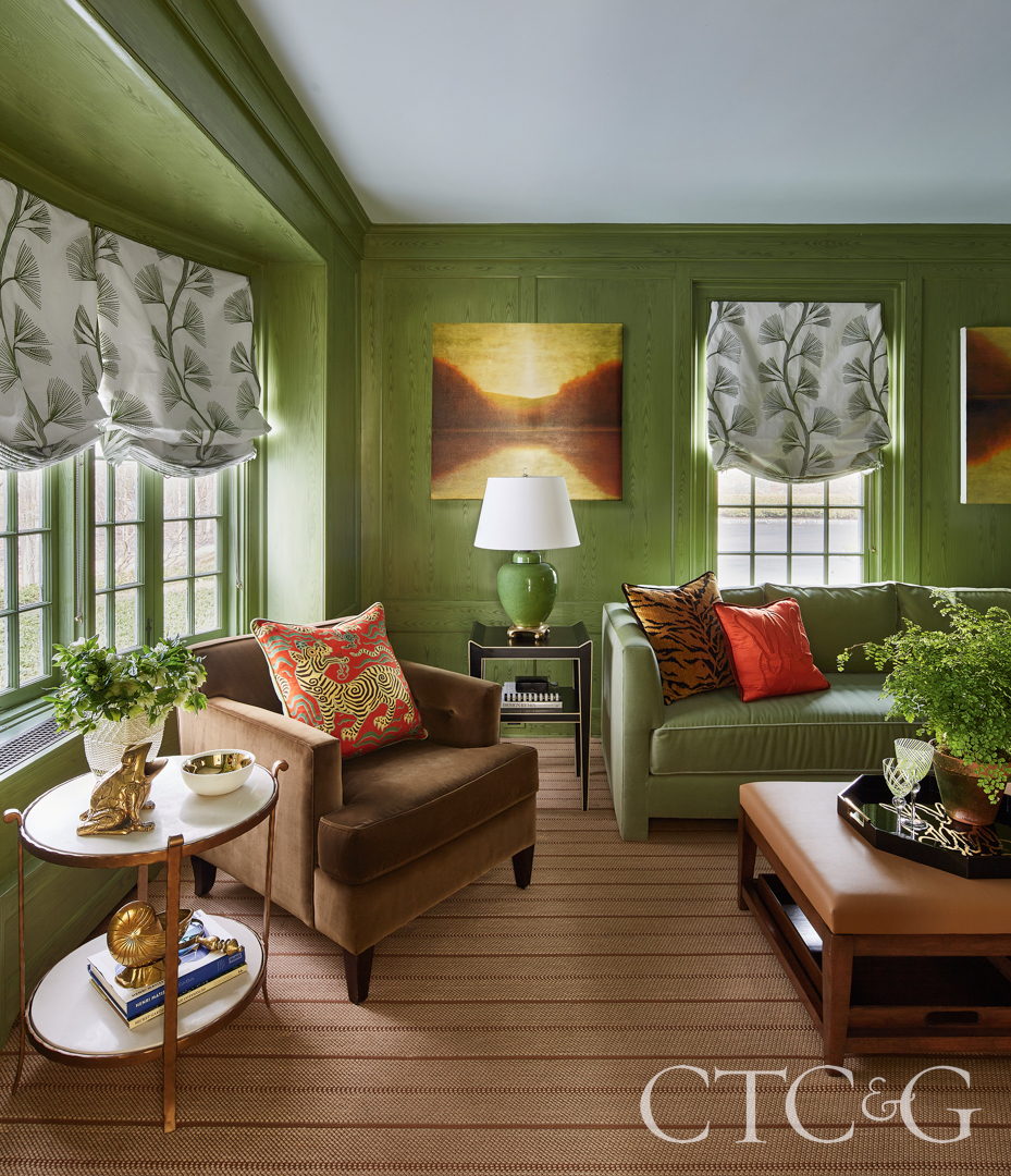
Next Garcia tackled the library that wore a trademarked look: wood paneling, a heavy brown desk and worn English armchairs covered in—you guessed it—a floral. Once again, the designer started with the color, this time green because of the outside views. Garcia had decorative painter Stephen D’louhy apply a faux grain on the wood. “We wanted to keep the original style of the home and not hide the wood paneling. The green is almost neutral, and the ceiling is the slightest hint of blue,” says Garcia. “We also used a lot of velvet. The client spends a lot of time in here in the winter, and I wanted it to feel cozy, but not heavy.” Garcia stayed true to the clients’ color palette with sage greens, neutrals and browns, but added spice as accents color. Behind the bookcase, she used Schumacher’s classic Feather Bloom sisal wallcovering. “It tied all the colors together and created more depth,” she says. Adds the client, “The library felt staid and hard and cold. Now, it’s been completely transformed into a room that’s fun, but peaceful.”
Upstairs, Garcia did more of the same, turning the children’s (now grown) bedrooms into more modern versions of their former traditional lives. Covering the walls with grasscloth and popping the rooms with sophisticated accents and colors. “The client and I worked so well together. We brought a beauty and freshness that had been missing to each room. We made each room bloom, and it really feels like her now.”