


Philip Gorrivan’s newest collection—Philip Gorrivan II for Duralee/Highland Court—debuted at the Winter Antiques Show at the Armory.
This seems very different from your 2008 line. Tell us about your evolution to the new collection. It is a bit of a departure. I wanted the new collection to be complementary to the first: a softer color palette, more tactile, finer weaves. Although there are several geometric weaves, they are not as bold, but rather more “diffused.” The [forty-three] patterns are inspired by ancient gardens, Savile Row tailoring, curiosities of nature and architecture.
Describe the palette that you used. I am very excited about the palette. Although this palette is very much on trend—I’m seeing the tones in many places, from fashion runways to magazines—it is also a very classic palette. Recently, I was at Maison & Objet in Paris, where I was showing the new collection, and found similar tones everywhere.
What were the inspirations behind your color choices? For each book, I was inspired by colors found in everyday objects, in nature and curiosities. The Saddle book is inspired by chestnut glass bottles from the 18th-century, old leather tomes and bridle leather. Patina-Olive ranges from the verdigris finish of copper to the turquoise in the feathers of a peacock and the olive green of hunting camouflage. Blush is inspired by the pinks and purples found in semiprecious stones and 17th-century frescoes. The gray tones of Kohl are from old cobblestone sidewalks, limestone houses and rock walls. Bone is inspired by the chalkiness of sun-bleached seashells and ancient walls.
Those are great names for the colorways: Saddle, Patina-Olive, Blush, Kohl and Bone. Thank you. I wanted the names of the books to be as descriptive as possible to the colors within.
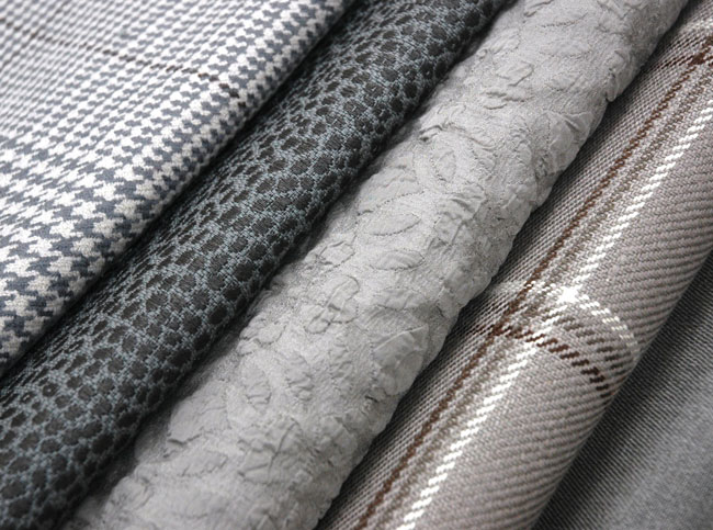
How did you incorporate texture? There is texture everywhere in the collection from cut velvets, embroideries and linen weaves to cotton and silk matelasse, even faux fur. Every fabric in the collection has texture in varying degrees.
The Philip Gorrivan II collection consists of a five color-book set
that complements his widely acclaimed debut series
Do you have a favorite fabric in the collection? I have several favorites, and have already redecorated my house many times…in my head! One of my favorites is Homer. It’s a very fine woven stripe in wool, one of the boldest patterns in the collection. I love the architectural quality of the “key” design. It’s inspired by the relief on the pediment of the entrance of a 17th-century church in Venice. I would love to decorate an entire room in this pattern—walls and all!
Which is your most unusual fabric? That is probably Julien. It is a large, abstract floral motif woven as a “scribble” on a cotton ground. It was inspired by an ancient turf maze in England called Julian’s Bower. This was taken up a notch with the weaving technique used. It is truly unusual; I’ve never seen anything like it.
Tell us about your new Ikat elephant fabric. I love ikats and felt it important to include at least one in this collection. I created my
own version this time, incorporating an elephant. Maharani comes in five rich tones, and the elephant’s trunk is appropriately turned upward for good luck.