


Designer Kylie K. Bass has created the ultimate retreat on Long Island for her New York City-based clients. “The design is intentionally light and airy, but we avoided leaning into a purely ‘summer home’ feel, since the family spends time here year-round,” Bass shares. “It was more about using colors and textures that feel cheerful and soothing—that same sense of ease you associate with summer.” Learn more about the final result below.
What was the overall scope of this project, and what were the homeowners’ main goals when they brought you on?
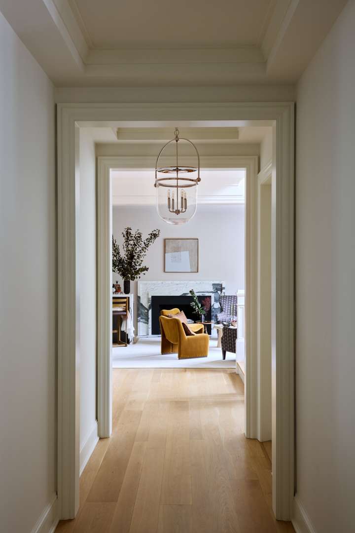
This home was originally built in 2015 and, like many high-end new builds of that time, had a more formal, “heavy” feel. I was brought on to help reimagine it into something lighter and more livable, while maintaining a sense of sophistication. We re-stained the floors, updated the staircase, and made cosmetic improvements throughout—including a few bathroom refreshes and a minor kitchen renovation. The goal was a home that felt comfortable, family-oriented, and relaxed, yet still polished enough for entertaining.

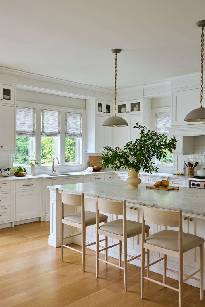
The home features generously sized spaces like the kitchen, dining, and living rooms. How did you approach working with the scale of these large areas to ensure they still feel cohesive and inviting?
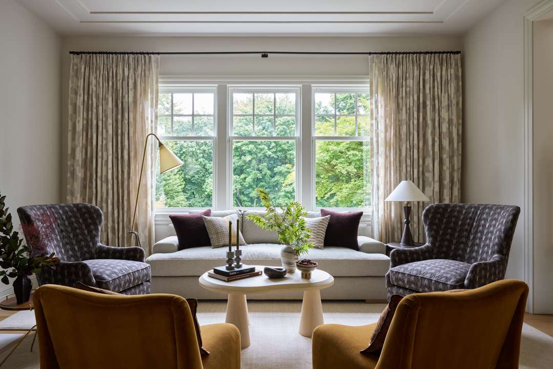
Scale was everything. We chose furniture with generous proportions (pieces that feel substantial and grounded) to balance the volume of each room. Large rugs anchor the zones and help define flow, while layered textures add warmth and intimacy. Even with their size, the rooms feel connected and comfortable.

What spaces in the home were specifically designed with entertaining in mind?
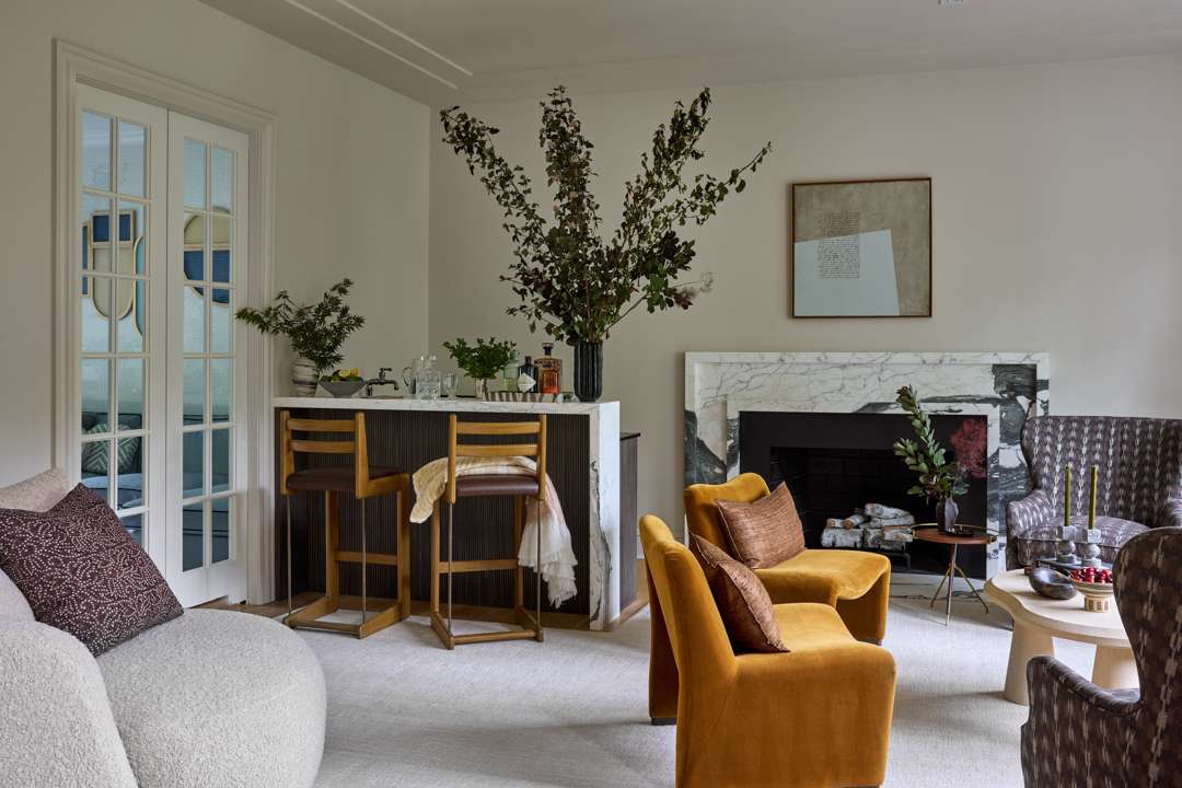
The living room was designed with entertaining at its core. The homeowners love to host, so they wanted to find a way of adding a wet bar to make the space functional for their lifestyle.

I love how the stone used on the wet bar matches the fireplace.
The stone is Arabescato Corchia from BAS and it’s truly stunning. I usually look for slabs with consistent veining, but here we embraced the asymmetry, which created a dramatic, organic look. We had enough material left over to use on the wet bar, which made it a natural choice. I always try to maximize what’s on hand, and extending the stone here added visual cohesion and saved the need for another slab!

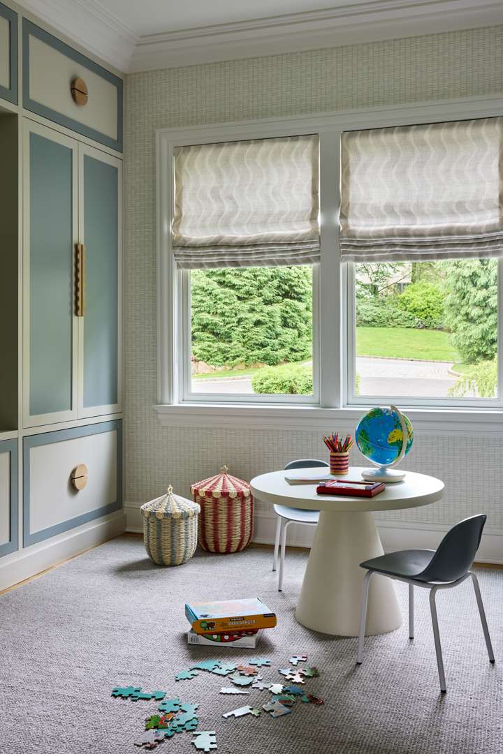
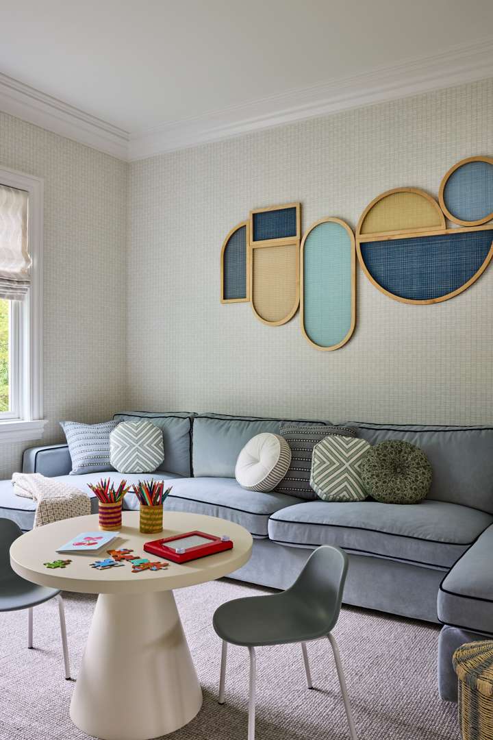
The playroom is located just off the living room. Was that layout part of the original floorplan? What about the unique cabinetry in the playroom?
In the original plan, these two rooms sat side by side without real separation. The clients wanted a first-floor playroom, so we added French doors to define the space while keeping light and sightlines open. The built-ins were custom designed to be fun and beautiful, but also to provide tons of concealed storage (key for quick clean-ups when guests are over!). The palette is calm and cohesive with the living room, so the spaces feel connected even when the doors are closed.

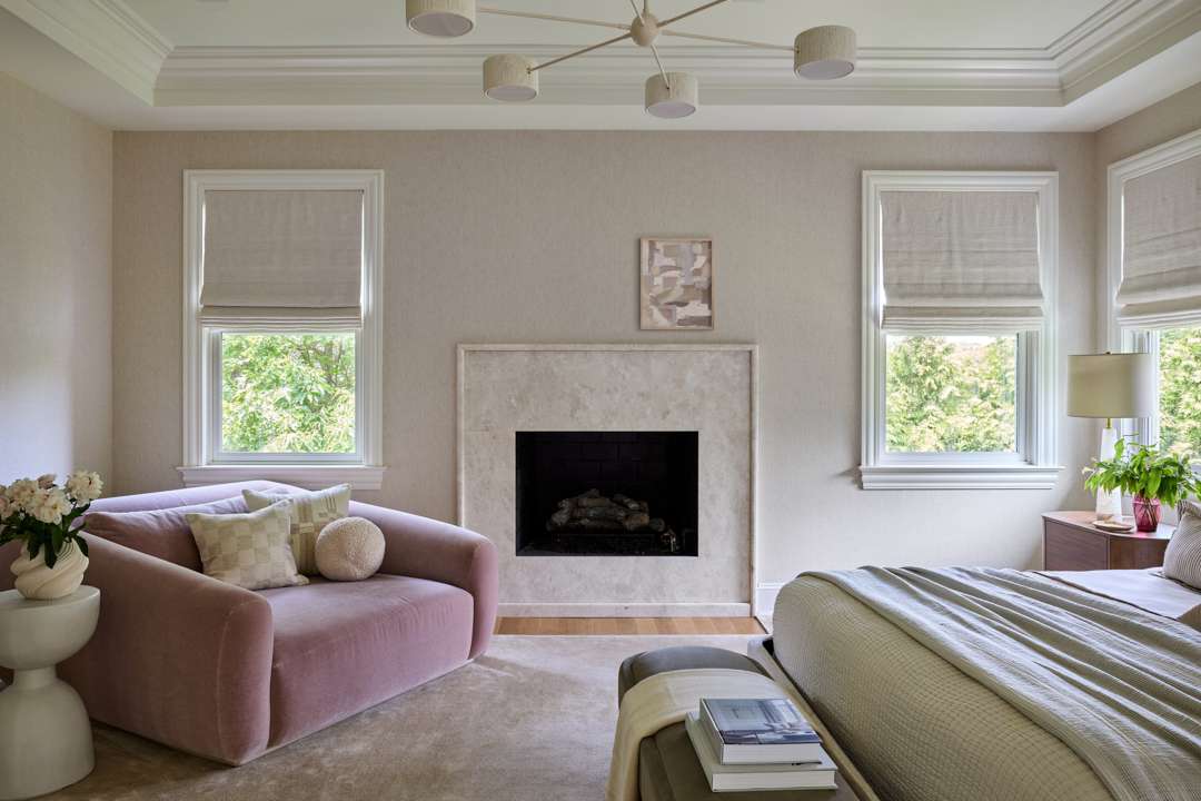
The palette and furniture mix in the primary bedroom feels so serene.
The primary bedroom was designed to feel like a “deep breath”—calm and simple. The upholstered bench is from Soho Home, and we loved the fabric as-is (a rare win!). The oversized chaise is from Lulu and Georgia, re-covered in a blush mohair. I love when clients embrace a subtle feminine touch. It adds softness without feeling overly decorative.

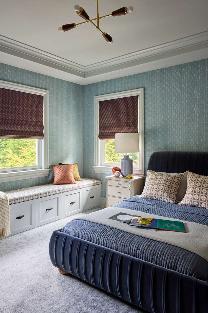
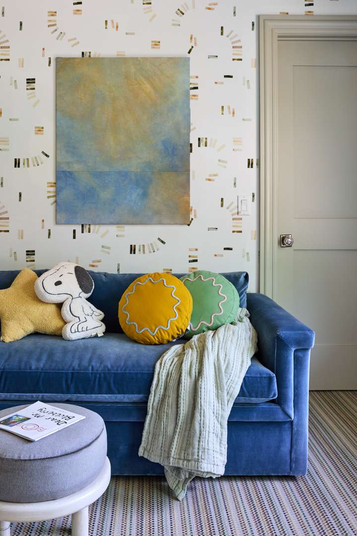
You previously told us that kids’ rooms are your favorite rooms to design. How do you approach kids’ rooms to ensure they are able to evolve over time?
I always start with a comfortable, versatile foundation my clients won’t tire of in a few years—whether that’s a timeless wallpaper, a textured rug, or built-ins that grow with the child. From there, I layer in personality through textiles, art, and accessories that can evolve as their interests do. In this home, we balanced playfulness with practicality, creating rooms that feel youthful and full of life without being overly themed. The goal is always longevity with flexibility.

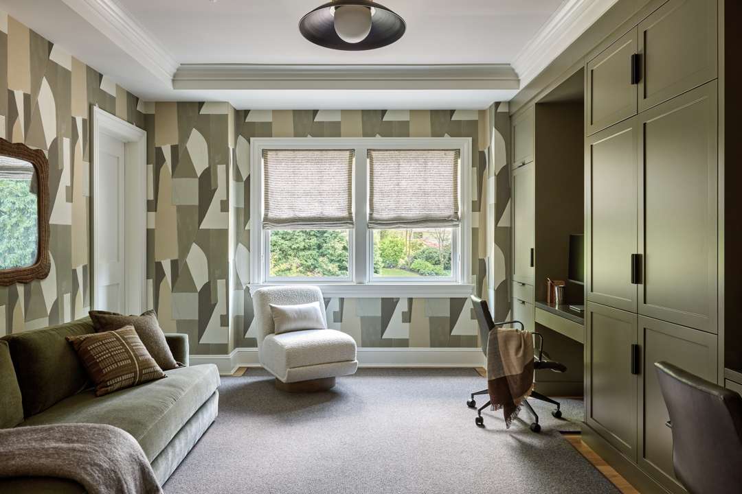
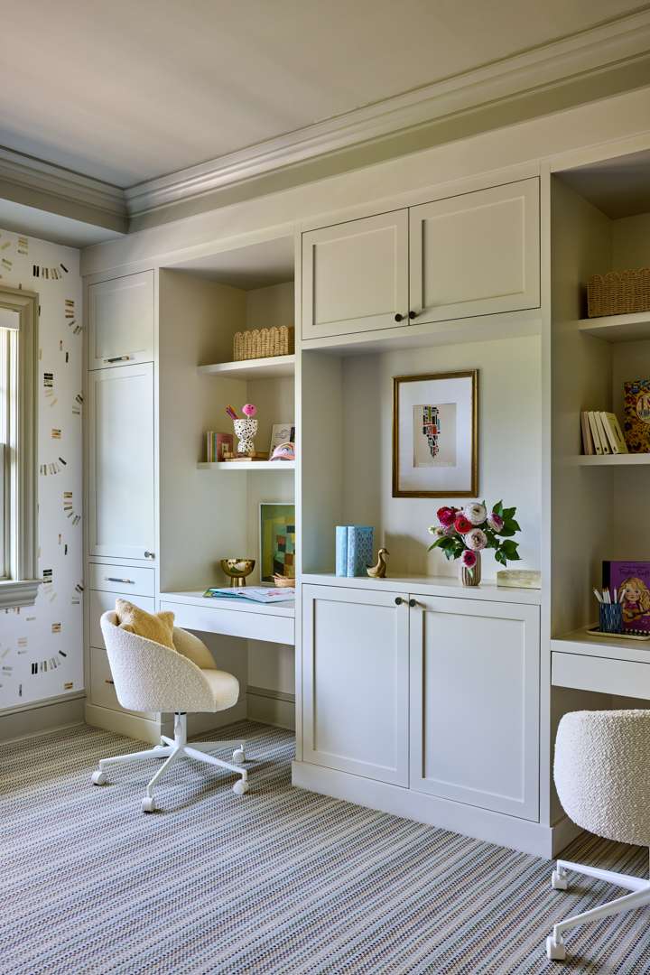
There are two different office spaces. What differentiates the two, both in function and design?
One office belongs to the parents, and the other is for the kids. The parents’ office has richer tones and a bold patterned wallcovering by Kelly Wearstler for warmth and a touch of fun, paired with millwork in Benjamin Moore Gloucester Sage and ceiling/trim in Benjamin Moore White Dove. The kids’ workspace is light and fresh, with softer colors and plenty of natural light, featuring wallpaper by Kelly Ventura, millwork in Benjamin Moore Gray Mist, and trim and ceiling in Benjamin Moore Paris Rain.

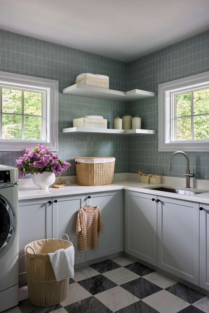
What are your laundry room design hacks?
My biggest tip is not to treat the laundry room as an afterthought. Add personality and it instantly feels special. In this project, we kept the existing base cabinets, counters, and plumbing, but transformed the space with a new floor, backsplash, floating shelves, updated hardware, and fresh paint. Small updates, big impact.