


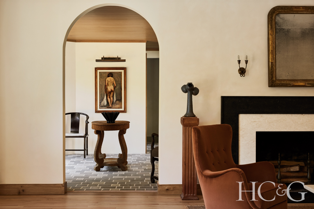
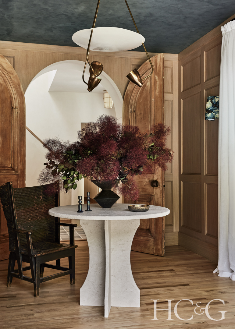
In the foyer, the table is custom by Garrick Rawding and The Hudson Company.

The living room features a sculptural armchair and a sofa from Maiden Home.
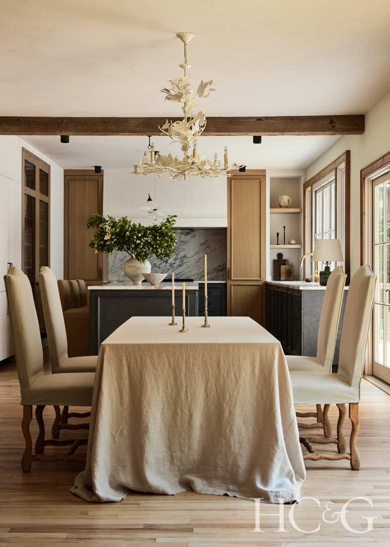
Vintage dining chairs from De Nille Antiques surround a Design Within Reach table.
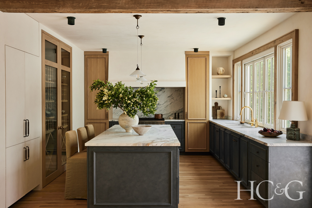
In the kitchen, the countertops are from Arena Stone NJ, and the bar stools are custom by Designers Guild.
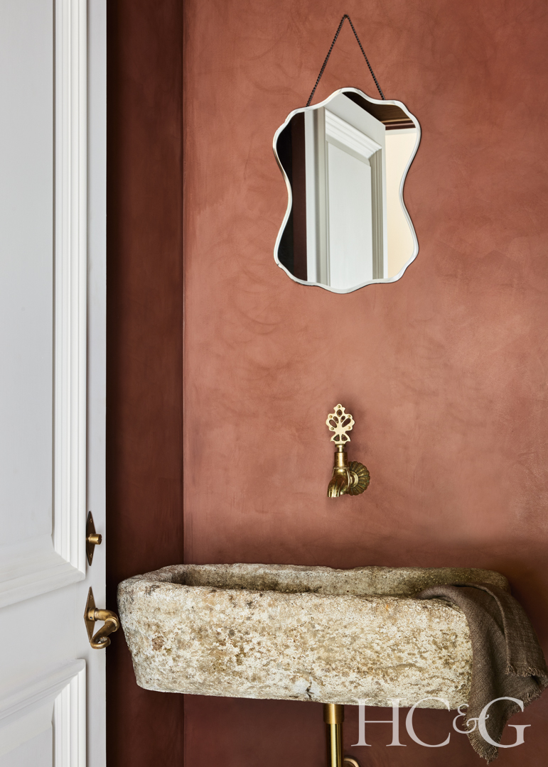
A custom limewash by Color Atelier covers the walls of the powder room. The sink is a vintage limestone trough from Olive Ateliers.
An antique Orkney chair from Heiberg Cummings complements a custom limestone table in the wine room.

The primary bedroom features a custom bed frame by Designers Guild.
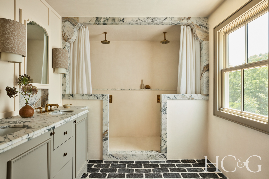
In the primary bath, Breccia turquoise slabs are from Arena Stone NJ.
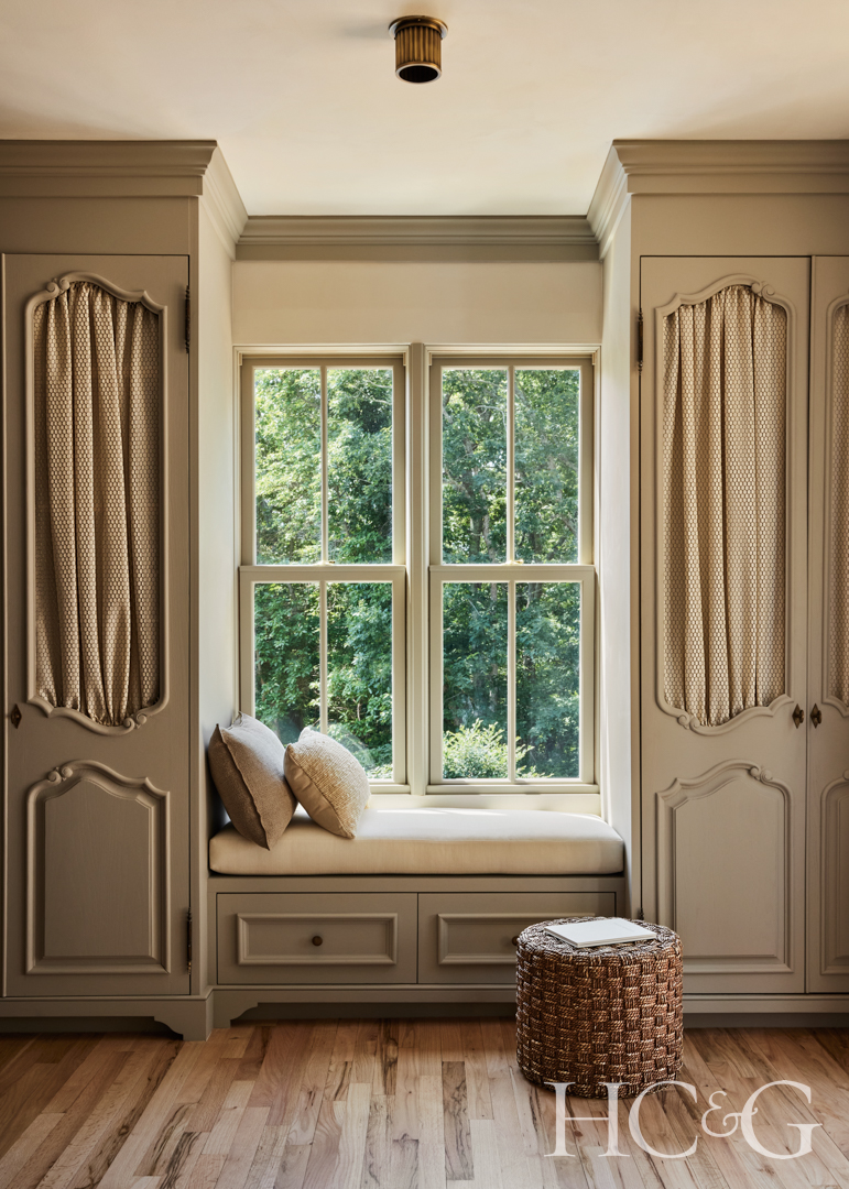
In the primary bedroom’s dressing room, a vintage Audoux-Minet stool is from Joseph Berry Interiors.
Shannon Assenza, HC&G: This is a wonderful home. What was the client looking for?
McKenzie Mulhouse of By George Collective: He was a single guy, and it was the first home he purchased. It needed a ton of work, but he just loved the location. It’s on two acres in a quiet Cedar Point cul-de-sac. The house had decent bones, but a really bad floor plan. We really wanted to open it up a little bit and make it better for summer entertaining. The theme really came from the architecture, and the exterior was very much inspired by French château-esque design, which is not very common for the Hamptons. I wanted it to be honest to what he wanted; he’s drawn to minimalism and masculine designs. We were trying to find that balance between transitional French style and what he is naturally drawn to.

This project is very warm. How did you choose the color palette?
The ceiling was a really nice attribute to the home, so the traditional all-white Hamptons home was not really going to work here. We wanted to do something different, with a little bit of soul, like it had always been there.

Which piece or pieces in the home do you love most?
The doors to the wine room, which I found on Facebook Marketplace—believe it or not, are true antiques that are absolutely stunning! If it wasn’t the marble, where I started, it started with those doors. That room in itself is probably what encompasses the house the most, and we designed that cool drinking room off the foyer—it’s a total departure from the all-white Hamptons style.

Tell me about your lighting choices.
It felt like I had to be careful with what we used for lighting—it couldn’t be too ornate, but also had to speak to the theme. I used lighting as a way to de-cliché it, and not go with the theme. For example, the chandelier in the dining room really feels like we elevated it. There wasn’t really anything else in the dining room because it’s open concept. In the kitchen, we went with something much more simple and minimalist because we had the beautiful cabinetry.

What was the inspiration behind the dining room?
We were kind of limited by space. It was a bit challenging because it is a bit of an open concept, so it needed to bridge the gap between a Belgian vibe in the living room to the more French country kitchen. I needed something that would feel good between both of those dials. I love the high-back chairs and their traditional element. Slipcovered in this beautiful linen, which is perfect for someone more practical, personalizes the home. The client had the dining table; I wanted to cover and soften it. The ceiling fixture was the hardest to pick out; I didn’t want it to take away from the beautiful arched entrance in the breezeway or the gorgeous kitchen, so we ended up with this soft, leafy one from Vaughan.

Tell me about the ceiling in the foyer.
The whole house is a limewash paint. Color Atelier is amazing at color matching. We finally landed on Benjamin Moore’s Racoon Fur in the entry, and designed that wine cellar in the kitchen to be transparent. I wanted to repeat that color in the cabinetry, which worked beautifully with white oak and marble slabs. That’s how it became one nice, fluid room. It’s a limewash with a sealer, which gives it movement and draws the eye up to that ceiling fixture.

How did you choose the color for the powder room?
I love burgundy tones, and it’s been such a popular tone. After we chose it, I started seeing burgundy everywhere. I wanted to do a contrast color to the blues we were using, and red is always a wonderful contrast to blue. I thought it would be a really nice moment, especially because we had blue notes in the tones in the floor. The breeze space had a very nice contrast to the bluestone. I wanted that little powder room to feel feminine against the more masculine surfaces on the floor.

How did you select the materials for the primary bath?
I chose the slabs of marble in the primary bath and kitchen before I chose anything else. They are beautiful turquoise slabs, and I loved all the tones in them. We were doing this project and we had to have blue somewhere; blue is a neutral to me. I also consider green and mustard neutrals. I knew the client wanted the project to feel very neutral, so we ended up with this very warm limewash that feels like a true home when you walk in.