


What an inviting home! What was the design directive?
Designer Sabina Szatko: Before, it was an older house in the suburbs, dreary with red wood. The clients wanted to brighten it up, and the wife loves a tropical aesthetic, but I felt that wasn’t the direction I wanted to take it since we’re up North. She loves the Colony Hotel down in Palm Beach, which is a heavy rattan style, so I wanted to merge those two together. In a sense, I didn’t think it fully matched the style of the home, so we added rattan pieces that gave it more of an ‘up North’ direction.
What was your inspiration?
SS: This client is fun—she works on graphics at Estée Lauder, and she does a lot of packaging and collabs. She’ll work with wallpaper companies for packaging designs; she is definitely ‘with it’ when it comes to beautiful things! She’s very fun and cool, and would pick up on references of things I would suggest. That let us go with a classic, yet modernized mix. She loves to wear funky clothes, and she always likes to bring in a little bit of that edge. There’s a little more midcentury in some of the forms, things that are a little more youthful.
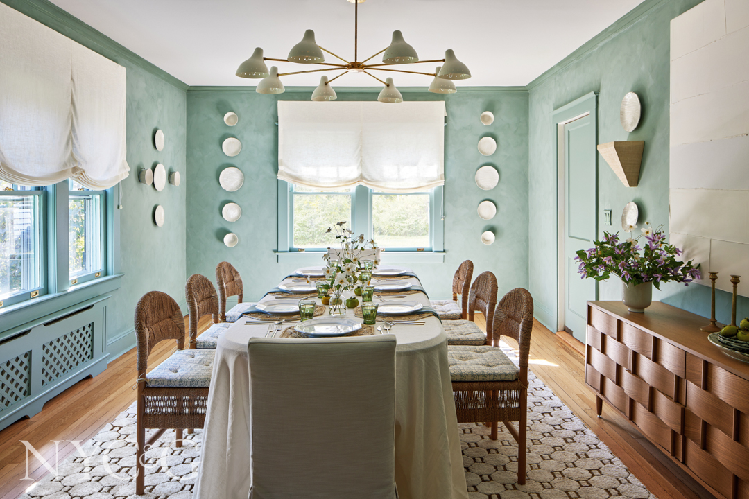
In the dining room, woven chairs surround a table from Lulu & Georgia. The luminous wall color is Rocco from Portola Paints.
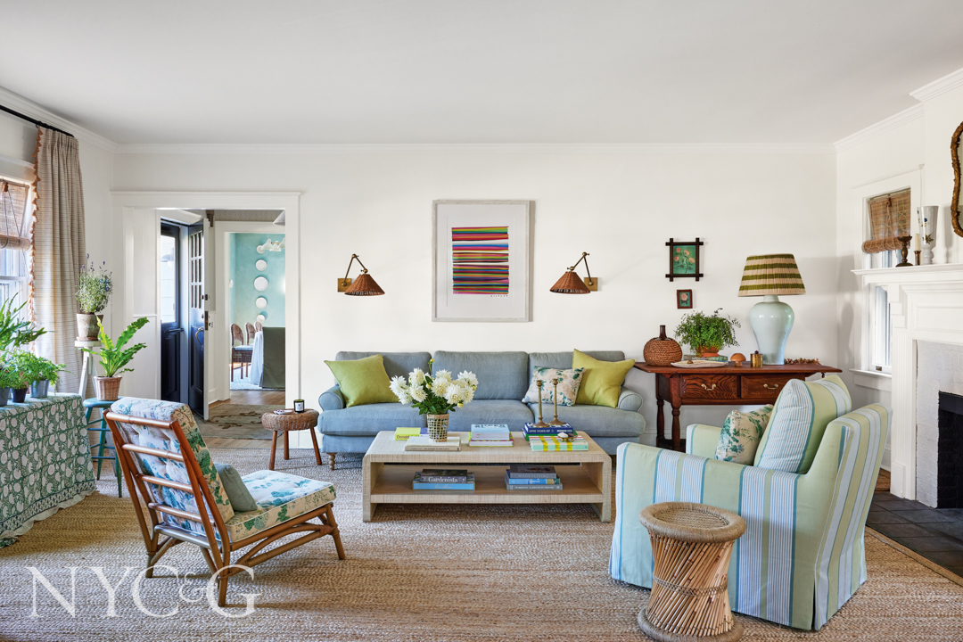
The living room’s textural coffee table complements a custom sofa from Interior Define. A slipper chair (near left) is covered in a Lee Jofa fabric, and the custom braided rug is from The Natural Carpet Company.
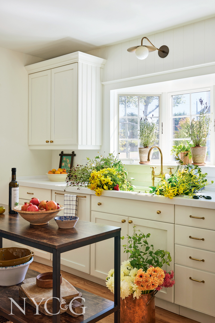
Kitchen cabinetry refinished in Benjamin Moore’s White Dove highlights sconces from Cedar & Moss.
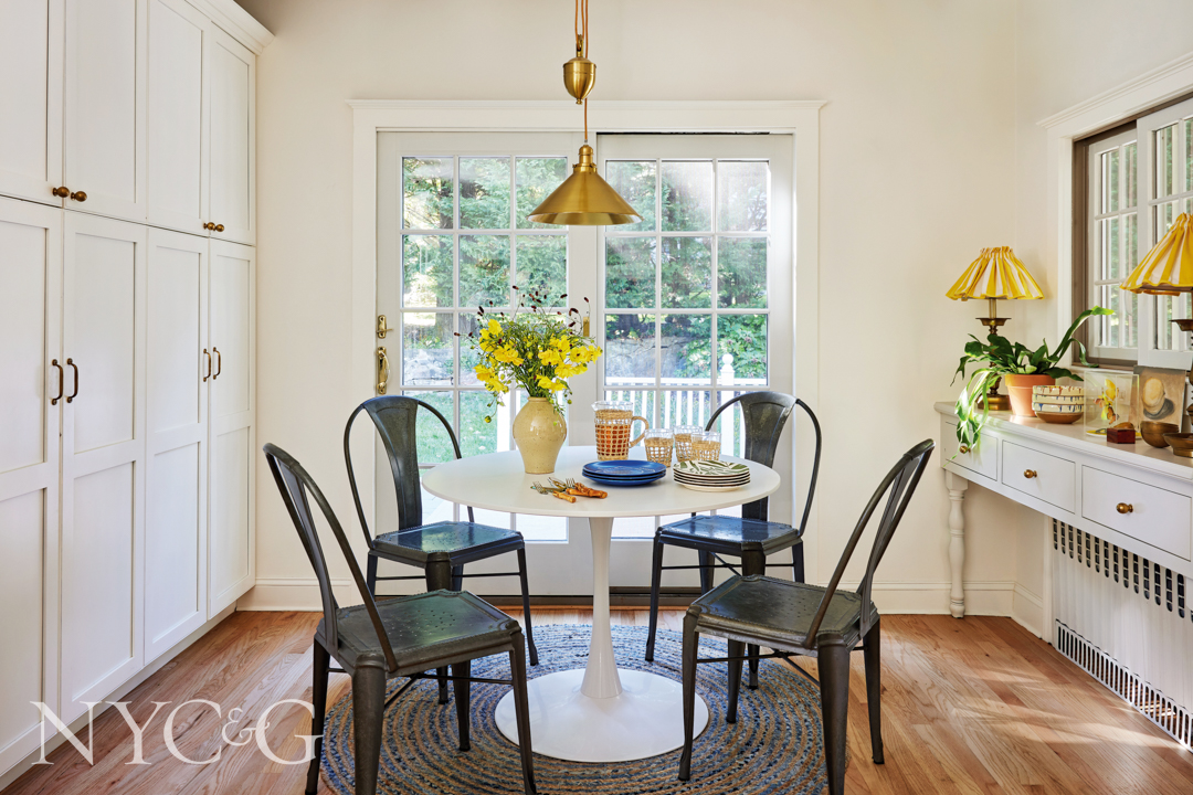
A pendant from Lucas McKearn hangs above the kitchen’s dining area, with industrial-style chairs from Tolix.
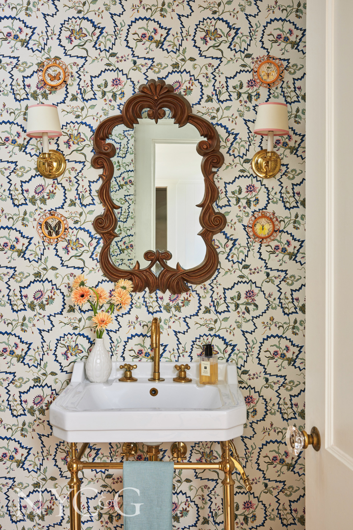
In the powder room, a vintage mirror hangs above a vanity from James Martin Vanities. The wallcovering is Braquenié’s La Pannonie from Pierre Frey.
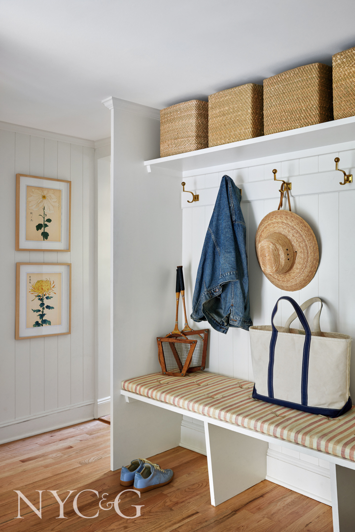
A simple bench in the mudroom is upholstered in a fabric by Kathryn M. Ireland.
Was there a design style you had in mind when designing the dining room?
SS: She really loves Florida, that tropical kind of environment, so it was about bringing in more woven-style textures, and that’s how we ended up going with the woven chairs. For the art on the walls, we didn’t want it to feel too dark. The room gets beautiful light, but it can go dark quickly. We thought a two-tone, white-and-blue palette would be cheerful. The Martha Stewart plates have a faux bois texture, which is like a fake wood, and is actually my favorite texture!
Tell me about the living room floorplan.
SS: The living room is extremely large, and it can accommodate a lot of furniture. The space actually includes three sofas. The rug we have is huge, but it has a beautiful coastal energy that the client really likes, so it unifies all of the pieces together. The previous homeowner had a rug that was shimmied more toward the window, so it felt like we expanded everything and pushed pieces against the walls a little closer. We worked on a furniture plan, which was complicated because it’s such a large room, and we wanted traffic to flow smoothly.

How involved were the clients in picking out furniture or color schemes?
SS: As I mentioned, the client wanted to go the Palm Beach route, but I didn’t feel it was fully appropriate for the style of the home, which is a Dutch Colonial. The Lee Jofa fabric on the slipper rattan chair is spread on the pillows throughout—the client really loved it, and it has colors that she enjoys. We scattered colors throughout the room to make it bright and punchy in a classical way, merging those two styles.
Which piece of furniture or artwork do you feel executes the theme or concept you were going for the most?
SS: One of the first pieces we bought for the house was that Lee Jofa fabric on the slipper rattan chair; it was a great starting point. Everything evolved from that fabric. The client didn’t want to do a standard brown sofa; she still wanted that pop of color. At one point we were thinking about a pink sofa, but wanted it to tie back to the slipper chair.

I love the wall covering in the powder room. How did you choose it?
SS: It’s a Braquenié wallpaper from the Pierre Frey archives, but at the same time it has a modern element to it with the blues and zig-zag lines. In this room, we originally picked this wallpaper because we had black tiles in the bathroom that they weren’t planning on replacing, but something happened and we had to take out the tiles and gut the whole bathroom. Thankfully, the wallpaper was already up. We also chose it because there was a bit of black in it, although it’s not a color I’m typically drawn to. I worked for designer Tom Scheerer for a decade, and he was a big mentor for me and inspired my color theory. The blues and turquoises, a lot of that comes from how comfortable I’ve gotten with those colors at Tom’s office. The client really enjoys pink. It’s funny—she has two boys and a husband, and she was like, ‘How can we do pink everywhere?’ I said that we can definitely do pink, but we have to do it in special and subtle moments.
There is a mix of neutrals and pops of color and patterns. How does a designer strike the right balance?
SS: I love getting inspiration from textiles first. Even in the mudroom, when I saw the bench with the striped cushion, I was like ‘This is perfect!’ The reason is because the fabrics lead the story—as long as you don’t go over the top—and also incorporate something more contemporary. The wallpaper in the bathroom is another great example, not to say it can’t veer sometimes. I’ve seen this pattern used in a more traditional space; it’s about what you have around it and not going too far with it.